The images below are the final edits of my magazine layout.
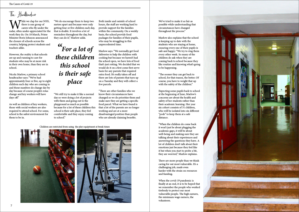
I made changes to title fonts and altered some of the images, changing the positions and tones. I also added another image to the final page as it felt as though something was missing.
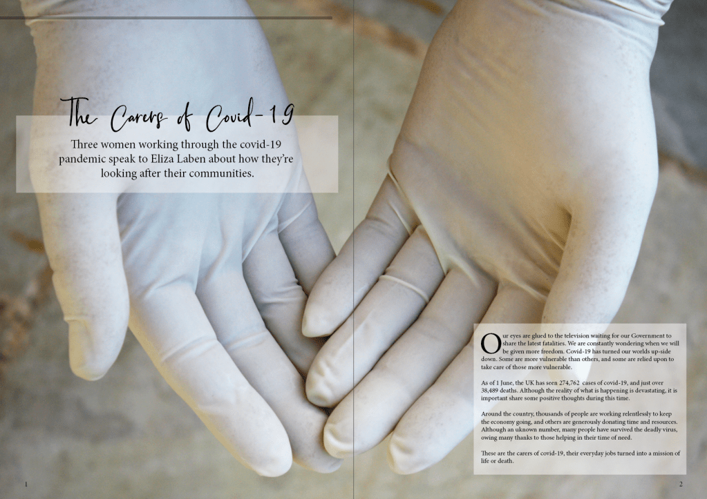
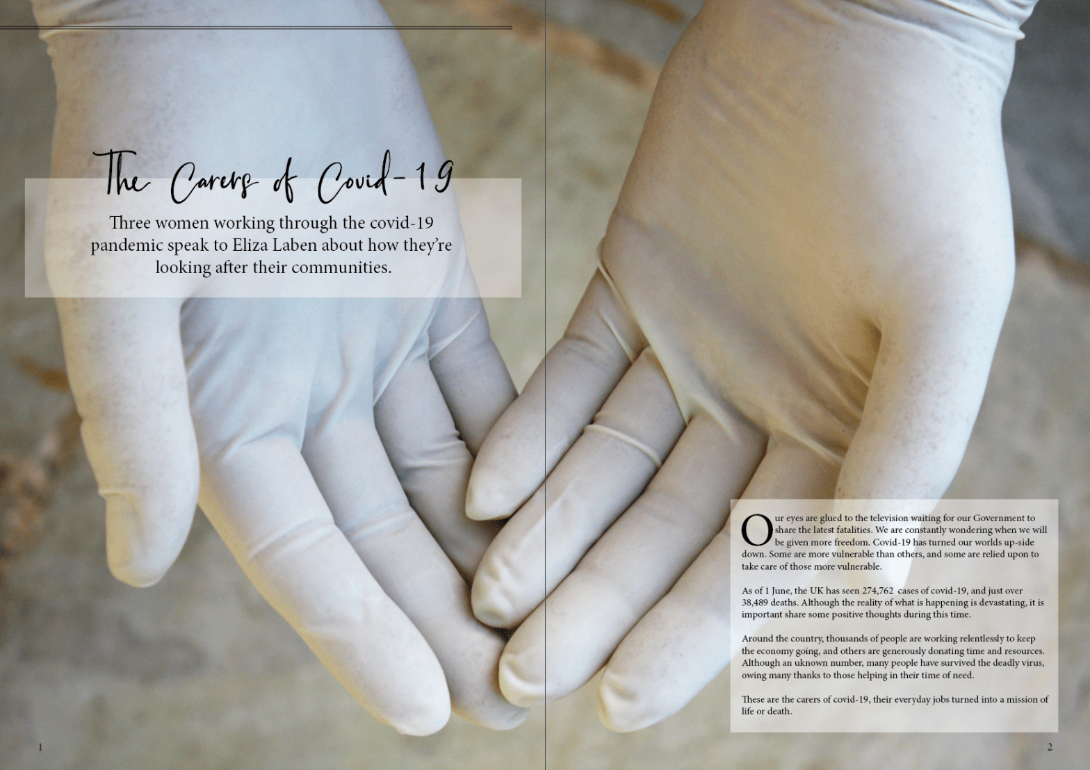
I wanted to keep the style of the whole piece very simple and minimalistic, focusing on the images and the importance of the article. This is especially noticeable in the cover page which was kept as one picture which flushes the whole spread.
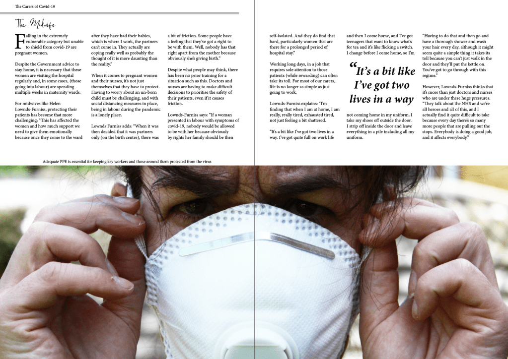
On the third spread I only used one picture because it is such an emotional picture and works perfectly in that layout. Adding anything else would have taken away from the effect.